
Understanding and Adjusting the Chosun Ilbo Myeongjo Font for Better Readability
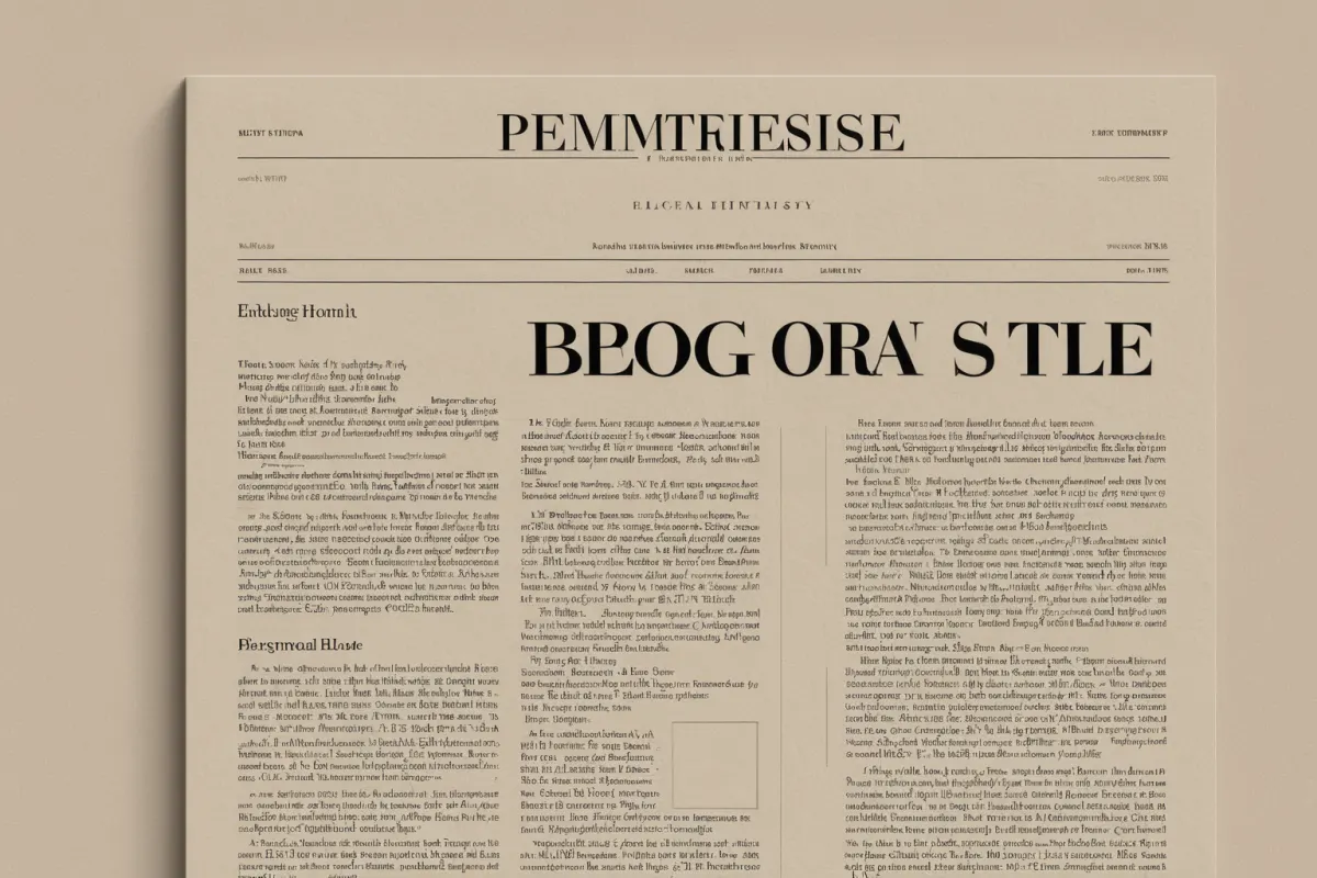
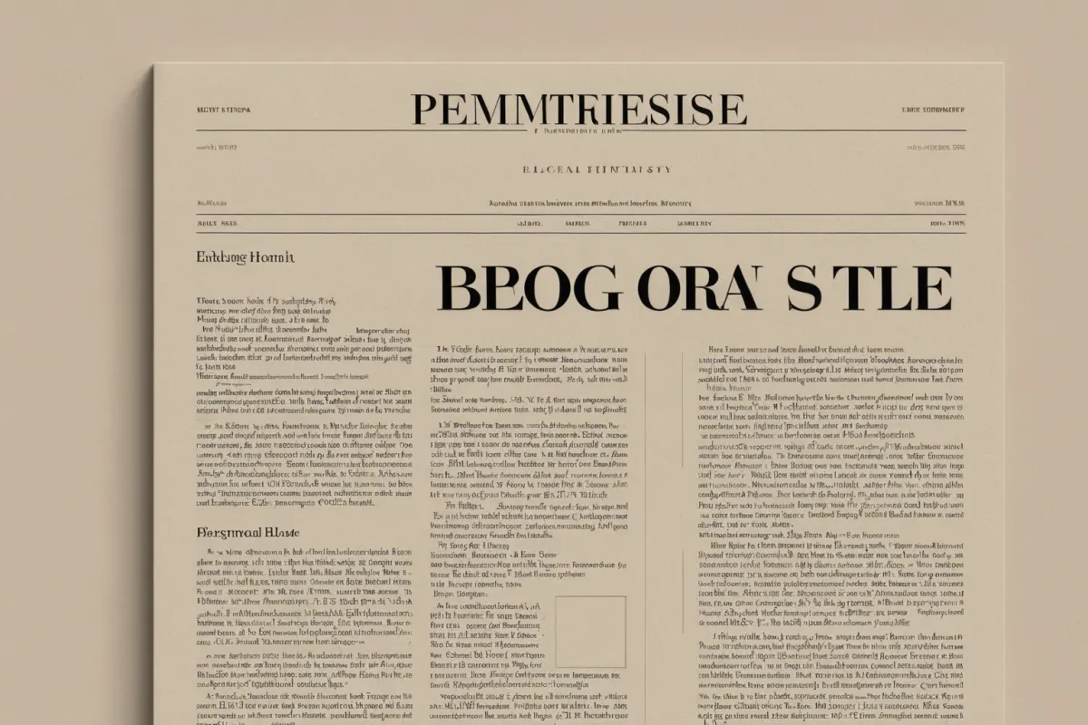
The Chosun Ilbo Myeongjo font, designed for newspaper layouts with a clean and neat appearance, can appear denser and thinner on screen compared to standard Myeongjo fonts. This often leads to perceived readability issues, but these problems are typically not due to the font itself—rather, they result from a combination of font size, line spacing, screen brightness, and rendering methods.
Simply increasing the text size slightly, adjusting line spacing generously, and using appropriate zoom can significantly improve readability. Since this font is meant to mimic print layouts, it's important to adjust settings once for optimal web or document use.
Why Chosun Ilbo Myeongjo Appears Thinner on Screen
The Chosun Ilbo Myeongjo font features distinct vertical and horizontal stroke contrasts designed for newspaper editing. While this creates a refined and clear appearance on paper, it can make strokes appear too thin on small screens.
Especially on low-resolution displays, in dark mode, or with minimal browser zoom, strokes may blur at the edges, making internal letter spaces feel cramped. This is why the same font can look different across monitors and smartphones.
For example, body text under 14px with tight line spacing causes eye strain over long reading sessions. Increasing to around 16px with a line height of approximately 1.6 maintains the newspaper-like feel while improving readability.
You can explore more articles on similar topics here.
View Related ArticlesKey Settings for Improving Readability
The first adjustment should be text size. Myeongjo fonts often feel cramped at smaller sizes, so using a slightly larger size than other fonts is recommended.
Second is line spacing. If lines are too close together, vertical strokes may overlap, increasing eye fatigue over time. For document editors, aim for 1.5–1.7; for web content, a minimum of 1.6 is ideal.
Third is paragraph width. Too many characters per line makes Myeongjo’s fine details appear crowded. Reducing the line length on screen can improve reading speed without affecting the font's essence.
The fourth factor is rendering method. Depending on browser or operating system, fonts may render differently—so previewing in actual display conditions is advisable.
Why Document and Web Settings Differ
In print documents, Chosun Ilbo Myeongjo shines due to stable stroke contrast and spacing on paper, making it ideal for newspaper articles or long explanations.
On the web, however, user environments vary widely, so a single setting won’t satisfy everyone. Instead of using the thin font as-is for body text, adjusting size and spacing together is more practical.
For example, when applying to blog posts, use another font for headings and Chosun Ilbo Myeongjo for body text at 17px or larger. For mobile banners or short notices, however, the font’s thinness may overshadow its benefits.
Practical Tips for Easier Use of Chosun Ilbo Myeongjo
First, apply bold only to key points rather than the entire body. Overuse of bold with Myeongjo’s strong stroke contrast can create a cramped appearance.
Second, consider background color. A slightly soft background often reduces eye strain compared to pure white—especially for long reading sessions where reducing high-contrast black text on white improves comfort.
Third, use line breaks. Breaking paragraphs into 2–4 lines instead of long blocks lessens the font’s density. Shorter paragraphs significantly improve perceived readability in long articles.
Fourth, adjust mobile zoom settings. On smartphones, adjusting browser text size before pinching to zoom keeps content cleaner and reduces blurring issues.
Common Use Cases for Chosun Ilbo Myeongjo
People searching for this font usually want a newspaper-like appearance or to apply a similar atmosphere in documents. Many also aim to create clean, trustworthy layouts resembling Chosun Ilbo editorials.
However, it’s not just about matching the font name—overall screen tone matters too. Too narrow spacing feels cramped, while overly wide line spacing weakens the newspaper feel. Ultimately, font and layout must work together harmoniously.
For example, for subscription notices or ad copy where information delivery is key, minimize decorative elements and prioritize readability. Short headlines, however, benefit from Myeongjo’s neat appearance.
Layout Tips for Subscription Notices and Newspaper-Style Content
For content-heavy sections like Chosun Ilbo subscription guides, clear structure matters. While using Chosun Ilbo Myeongjo for body text, mix in clearer fonts for subheadings and button-like phrases—common practice in real-world applications.
When multiple notices appear on a single screen (like Chosun Members or the Chosun Ilbo homepage), avoid overusing Myeongjo across wide areas. Apply it only to key paragraphs, and use clearer fonts for lists and guides to make information more digestible quickly.
For example, in article-style introductions, keep the first paragraph in Chosun Ilbo Myeongjo while using standard body text for other sections. This maintains a newspaper-like feel while improving mobile readability.
Quick Readability Settings Checklist
When starting out, focus on three key factors: text size, line spacing, and paragraph width. Adjust the rest as needed through trial and error. Instead of aiming for perfection upfront, check what feels easiest to read.
For web documents, start with body text at 16–18px, line height around 1.6, and paragraph width near 600px. For print documents, preview at 10.5pt–12pt range before finalizing.
Chosun Ilbo Myeongjo looks elegant when properly adjusted, but even small missteps can make it feel cramped. Remember: optimizing the reading environment matters more than just selecting the font—this reduces trial-and-error and improves results.
Frequently Asked Questions
Q1. Why does Chosun Ilbo Myeongjo appear thinner than other Myeongjo fonts?
This is due to its fine stroke structure designed for newspaper layouts. On small screens or with low zoom, it can look thin and dense.
Q2. What should I adjust first to improve readability?
Text size and line spacing are the most effective starting points. Then check paragraph width and letter spacing as needed.
Q3. How do I make it readable on mobile devices?
Use generous text sizes, break paragraphs into shorter sections, and avoid extreme contrast. Avoid long blocks of text in a single paragraph for better readability.
When using Chosun Ilbo Myeongjo, remember that optimizing the reading environment matters more than just selecting the font itself. Display differences may vary depending on operating system, browser, document program, or screen resolution—so always preview on your actual device before finalizing.
Continue exploring articles on similar topics.
View Category ArticlesFAQ
Why does Chosun Ilbo Myeongjo appear thinner than other Myeongjo fonts?
This is due to its fine stroke structure designed for newspaper layouts. On small screens or with low zoom, it can look thin and dense.
What should I adjust first to improve readability?
Text size and line spacing are the most effective starting points. Then check paragraph width and letter spacing as needed.
How do I make it readable on mobile devices?
Use generous text sizes, break paragraphs into shorter sections, and avoid extreme contrast. Avoid long blocks of text in a single paragraph for better readability.
Korean Source
This article is an English localization of a Korean-language report from BlogScore. Original: 조선일보 명조체 글꼴 차이와 가독성 설정 팁