
Responsive Web Design with Media Queries: A Beginner's Guide
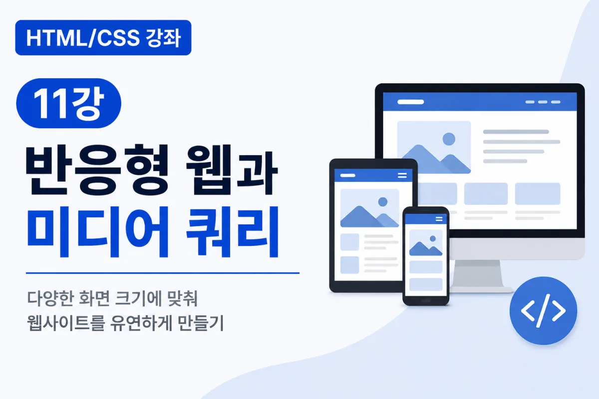

What Is Responsive Web Design?
In the past, most people used computers to access the internet.
Today, the situation has changed significantly.
Websites are accessed from various devices:
Desktop computers
Laptops
Tablets
Smartphones
If a website is designed only for desktop screens, it may appear too small or broken on smartphones.
To solve this issue, responsive web design (Responsive Web) was introduced.
Why Responsive Web Design Is Needed
Consider an online store as an example.
On a desktop, you can display four products per row.
However, on a smartphone with a narrower screen, it's easier to view one product per row.
Responsive web design automatically adjusts the layout based on screen size.
This allows a single website to support multiple devices effectively.
Setting Up the Viewport
The first step in creating responsive web design is setting up the viewport.
Add the following code inside the <head> tag of your HTML:
<meta name="viewport" content="width=device-width, initial-scale=1.0">
This code tells mobile browsers to display the webpage according to screen size.
Today, this setting is used by almost all websites as a standard practice.
What Are Media Queries?
Media queries are a feature that applies different CSS based on screen size.
For example, you can use larger text on desktops and slightly smaller text on smartphones.
The basic structure looks like this:
@media (max-width:768px){

}
This means apply the CSS inside only when the screen width is 768px or less.
Adjusting Font Sizes
You can specify different font sizes based on device type.
h1{

    font-size:48px;

}
For mobile devices:
@media (max-width:768px){

    h1{

        font-size:30px;

    }

}
This ensures text remains readable on smaller screens.
Adjusting Menus
On desktops, menus are often displayed horizontally.
.menu{

    display:flex;

}
But on smartphones, a vertical menu is more readable.
@media (max-width:768px){

    .menu{

        flex-direction:column;

    }

}
The menu direction automatically changes based on screen size.
Adjusting Card Layouts
Product listings or blog cards can also be made responsive.
Desktop:
.cards{

    display:flex;

    gap:20px;

}
Mobile:
@media (max-width:768px){

    .cards{

        flex-direction:column;

    }

}
On smartphones, cards align vertically for better readability.
Making Images Responsive
To make images responsive, use the following code:
img{

    max-width:100%;

    height:auto;

}
This ensures large images automatically resize while maintaining their aspect ratio.
This is a very common code used in responsive web design.
Common Screen Sizes Used
In responsive web design, the following screen sizes are commonly used:
Device | Screen Size |
|---|---|
Mobile | 768px or less |
Tablet | 769px to 1024px |
Laptop | Over 1025px |
Desktop | Over 1200px |
The exact values may vary slightly depending on the project, but this is the most commonly used standard.
Using Multiple Media Queries
You can use multiple conditions for different screen sizes.
@media (max-width:1024px){

}

@media (max-width:768px){

}

@media (max-width:480px){

}
This allows you to gradually adjust the layout as screen size decreases.
Using with Flexbox
Flexbox and media queries are often used together.
For example:
.container{

    display:flex;

    gap:20px;

}
And:
@media (max-width:768px){

    .container{

        flex-direction:column;

    }

}
On desktops, the layout is horizontal,
and on mobile devices, it switches to vertical automatically.
This is currently the most commonly used approach for responsive layouts.
Testing in Chrome
You can easily test responsive websites using Chrome Developer Tools.
PRESS F12.
CLICK the mobile icon.
SELECT your preferred smartphone model.
ADJUST the screen size to see changes.
You can test most screen sizes without having a physical smartphone.
Good Habits for Responsive Web Development
Adopting these habits will make maintenance easier:
Use fluid rather than fixed dimensions
Make good use of Flexbox
Apply
max-width:100%to imagesAvoid creating too many media queries
Test on actual smartphones
Common Beginner Mistakes
1. Forgetting to set the viewport
The viewport setting is essential for responsive web design.
2. Using fixed width values
width:1200px;
Using a fixed large width like this can cause issues on mobile devices.
3. Fixing image sizes
Instead of using fixed sizes, it's better to use:
max-width:100%;
This ensures images scale properly.
4. Skipping mobile testing
What looks good in a browser might appear differently on an actual smartphone, so always test on real devices.
Key Takeaways from This Lesson
Let's summarize what we've covered today:
Responsive web design automatically adjusts layouts for different screen sizes.
Viewport settings are fundamental to responsive web design.
Media queries change CSS based on screen size.
Combining Flexbox with media queries makes creating responsive layouts easier.
Use
max-width:100%for images to ensure they scale properly.You can test different screen sizes using Chrome Developer Tools.
Responsive web design is a fundamental skill every modern web developer must learn.
In Conclusion
This lesson covered the concept of responsive web design and how to adjust layouts based on screen size using media queries.
You now have the foundation to create websites that look good on both desktops and smartphones.
Next, we'll learn about creating common UI elements like buttons, cards, and menus. You'll implement practical examples used in real-world websites to further improve your CSS skills.
FAQ
What is the purpose of a viewport meta tag?
The viewport meta tag tells mobile browsers how to control the page's dimensions and scaling, ensuring proper display on different devices.
Why should I avoid fixed width values in responsive design?
Fixed width values can cause layout issues on smaller screens, making content too narrow or requiring horizontal scrolling.
What is the most common screen size breakpoint for mobile?
The most commonly used mobile breakpoint is 768px or less, which covers most smartphones and smaller tablets.
Korean Source
This article is an English localization of a Korean-language report from BlogScore. Original: [Html/CSS 강좌] 11강 반응형 웹과 미디어 쿼리(Media Query)