
Flexbox Layout Basics: A Beginner's Guide to Modern CSS
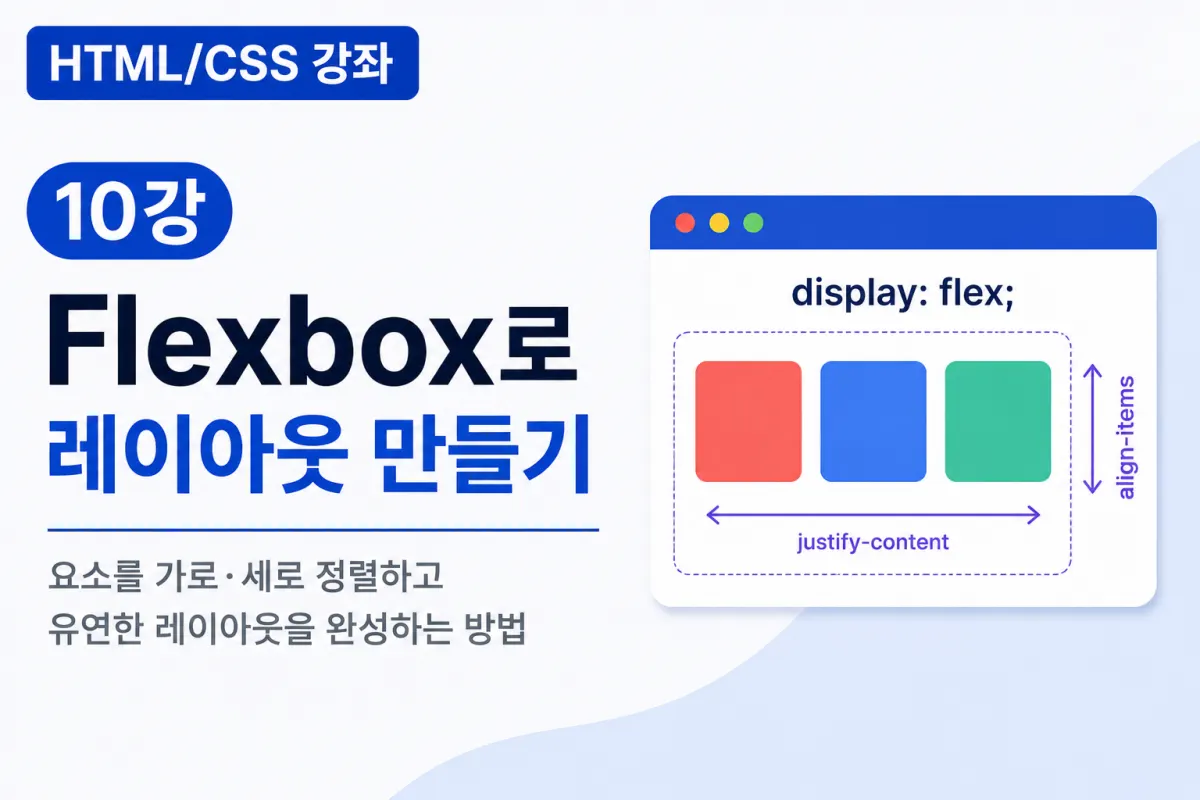
What is Flexbox?
When building websites, you'll often encounter layouts like these:
Displaying menus horizontally
Arranging multiple cards side by side
Centering buttons
Placing images and text side by side
This ability to freely align elements is exactly what Flexbox provides.
Flexbox is a layout method introduced in CSS3, now the standard technique used across most websites today.
Why Use Flexbox?
In the past, developers often relied on float to arrange elements horizontally.
However, this approach led to complex code that was difficult to maintain.
Flexbox was created to solve these problems and offers several advantages:
Easier horizontal and vertical alignment
Simple centering of elements
Convenient implementation of responsive web designs
More concise code
Better adaptability to various screen sizes
The Basic Structure of Flexbox
Flexbox consists of two main components:
Parent (Container)
Children (Items)
When you apply Flexbox to a parent element, its child elements automatically align according to the Flex rules.
For example, consider this HTML structure:
<div class="container">

    <div>1</div>

    <div>2</div>

    <div>3</div>

</div>
display: flex
The foundation of Flexbox is this single line of code:
.container{

    display:flex;

}
This makes child elements align horizontally by default.
Before and After Applying Flexbox
Before Application
1

2

3
Elements are stacked vertically.
After Application
1 2 3
Elements align horizontally automatically.
This is Flexbox's most basic functionality.
justify-content
Horizontal alignment is controlled with justify-content.
Center Alignment
justify-content:center;
Left Alignment
justify-content:flex-start;
Right Alignment
justify-content:flex-end;
Space Between
justify-content:space-between;
Even Space Around
justify-content:space-around;
Or:
justify-content:space-evenly;
can also be used.
align-items
Vertical alignment is handled with align-items.
Center Alignment
align-items:center;
Top Alignment
align-items:flex-start;
Bottom Alignment
align-items:flex-end;
With Flexbox, you can easily align elements both horizontally and vertically.
Centering Elements
This is one of the most commonly used techniques in web development.
.container{

    display:flex;

    justify-content:center;

    align-items:center;

}
This centers elements within the container on the screen.
flex-direction
You can change the direction of element placement.
The default is:
flex-direction:row;
To arrange elements vertically, use:
flex-direction:column;
flex-wrap
If there are too many elements, they can automatically wrap to the next line.
flex-wrap:wrap;
This is commonly used in e-commerce layouts with multiple cards.
gap
Flexbox makes it easy to define spacing between elements.
gap:20px;
This creates consistent spacing without needing to set margins individually for each element.
This property is frequently used in real-world development.
Creating a Simple Menu
HTML
<nav class="menu">

    <a href="#">Home</a>

    <a href="#">Courses</a>

    <a href="#">Contact</a>

</nav>
CSS
.menu{

    display:flex;

    gap:30px;

}
This creates a clean horizontal menu layout.
Creating a Card Layout
HTML
<div class="cards">

    <div>Card 1</div>

    <div>Card 2</div>

    <div>Card 3</div>

</div>
CSS
.cards{

    display:flex;

    gap:20px;

}
This is a common layout pattern for blog posts or product listings.
Using Flexbox with Box Model
Flexbox often works well with the CSS Box Model.
For example:
.card{

    padding:20px;

    border:1px solid #ddd;

    border-radius:10px;

}
and
.cards{

    display:flex;

    gap:20px;

}
together create a clean card layout.
Common Beginner Mistakes
1. Applying display:flex to children instead of parent
Flexbox should be applied to the parent element, not the child elements.
2. Confusing justify-content and align-items
justify-content → Horizontal alignment
align-items → Vertical alignment
With the default row direction, this is easy to remember.
3. Using margin instead of gap
Using gap in Flexbox is simpler and easier to manage than setting margins individually for each element.
4. Trying to build all layouts with Flexbox alone
For complex two-dimensional layouts, CSS Grid might be more appropriate.
However, most standard website layouts can be implemented effectively with just Flexbox.
Key Takeaways from This Lesson
Let's summarize what we've learned today:
Flexbox is a modern CSS layout technique.
Use
display:flexto arrange elements horizontally by default.justify-contenthandles horizontal alignment.align-itemshandles vertical alignment.flex-directionchanges the layout direction.flex-wrapenables automatic line wrapping.gapeasily defines spacing between elements.Flexbox is used for menus, cards, buttons, galleries, and many other layout types.
Understanding Flexbox allows you to implement most web page layouts with ease.
In Conclusion
This lesson covered how to use the widely adopted Flexbox for flexible element placement in modern web development.
While Flexbox has many properties, you'll find that focusing on display:flex, justify-content, align-items, and gap is enough to create a wide range of layouts.
In our next lesson, we'll explore responsive web design with media queries (Media Query) to build websites that look great on desktops, tablets, and smartphones alike.
FAQ
What is Flexbox used for?
Flexbox is a CSS layout model that simplifies creating responsive designs by allowing elements to be arranged in flexible, adaptive layouts.
How do I center an element using Flexbox?
Apply display:flex; along with justify-content:center and align-items:center to the parent container for both horizontal and vertical centering.
When should I use Flexbox instead of CSS Grid?
Use Flexbox for one-dimensional layouts (like menus or cards), and CSS Grid for more complex two-dimensional layouts.
Korean Source
This article is an English localization of a Korean-language report from BlogScore. Original: [Html/CSS 강좌] 10강 Flexbox로 레이아웃 만들기