
Creating Common UI Elements: Buttons, Cards, and Menus with HTML & CSS
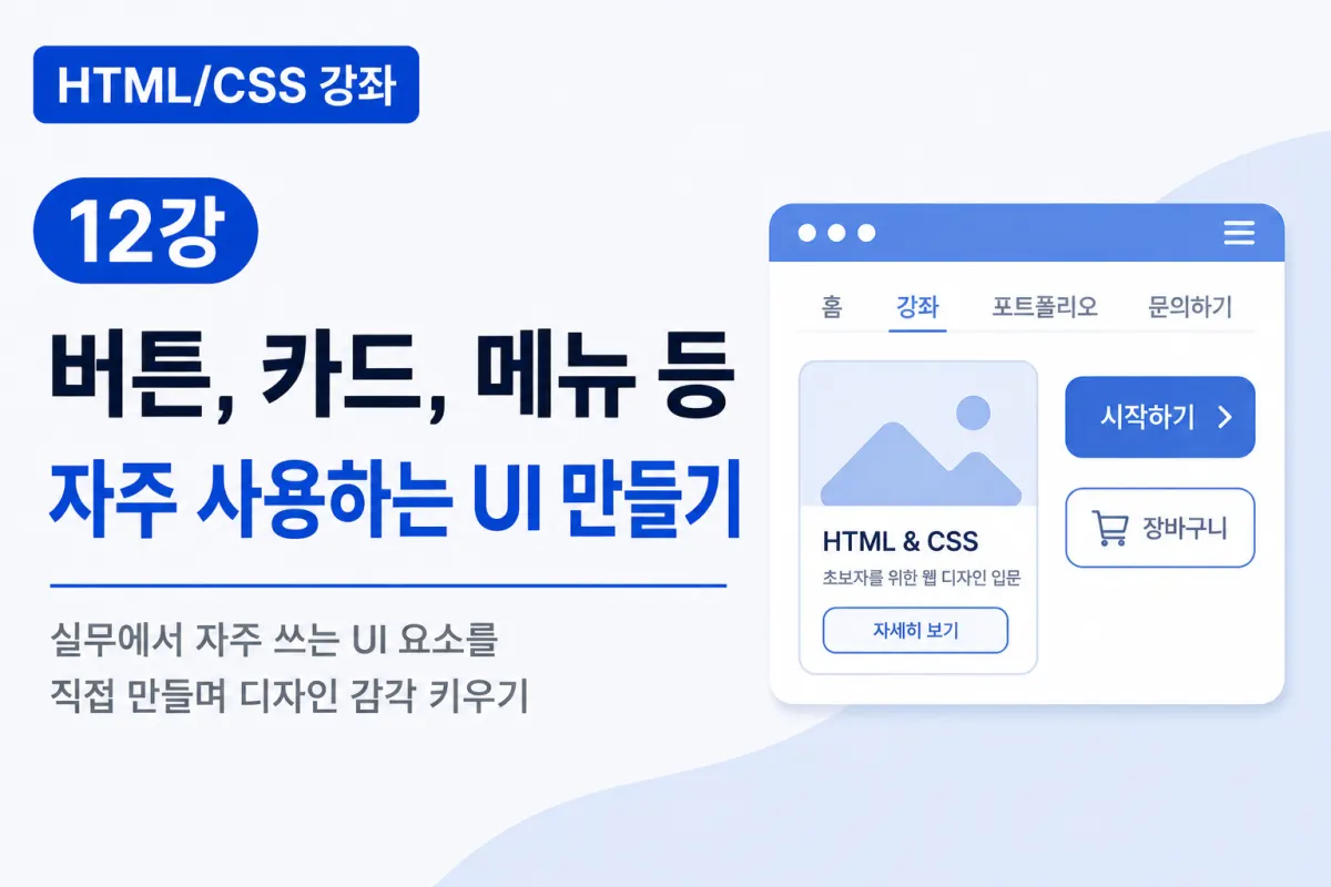
What is UI (User Interface)?
UI stands for User Interface, referring to the visual elements on a website that users interact with.
Examples of UI include:
Buttons
Menus
Cards
Search fields
Login screens
Sign-up pages
Banners
Navigation bars
A good UI helps users navigate and interact with a website easily and comfortably.
Creating Buttons
Buttons are the most commonly used UI elements on websites.
HTML
<button class="btn">

시작하기

</button>
CSS
.btn{

    background:#154B95;

    color:white;

    padding:12px 24px;

    border:none;

    border-radius:8px;

    cursor:pointer;

}
Applying simple styles transforms a basic button into something visually appealing.
Adding Hover Effects
You can change the color of a button when hovering over it with the mouse.
.btn:hover{

    background:#0f3972;

}
This feature is called Hover Effect, a common technique used on websites.
What are Cards?
Cards organize multiple pieces of information in a box-like format.
You'll commonly see cards used for:
Blog post listings
E-commerce product displays
Course listings
Announcements
News articles
Cards effectively present information in a visually organized way.
Creating Cards
HTML
<div class="card">

    <h3>HTML Course</h3>

    <p>Learn web development from the basics</p>

</div>
CSS
.card{

    width:300px;

    padding:20px;

    border:1px solid #ddd;

    border-radius:10px;

}
A clean card is now complete.
Adding Shadow to Cards
You can make cards appear more three-dimensional by adding a shadow effect.
box-shadow:0 4px 12px rgba(0,0,0,0.1);
This property is frequently used in professional web design.
Apply shadows subtly for a natural look rather than making them too strong.
Creating Menus
Most websites feature top navigation menus.
HTML
<nav>

    <a href="#">Home</a>

    <a href="#">Courses</a>

    <a href="#">Contact</a>

</nav>
CSS
nav{

    display:flex;

    gap:30px;

}
Using Flexbox makes it easy to arrange menu items horizontally.
Menu Hover Effects
Applying hover effects to menus enhances user experience.
nav a:hover{

    color:#154B95;

}
This helps users identify which menu items are clickable.
Combining Buttons and Cards
HTML
<div class="card">

    <h3>HTML & CSS</h3>

    <p>Web design course for beginners</p>

    <button class="btn">

        View Details

    </button>

</div>
Placing buttons within cards creates a layout similar to e-commerce sites or blogs.
Creating Rounded Buttons
Making corners more rounded gives a softer appearance.
border-radius:50px;
Rounded buttons are increasingly common on modern websites.
Buttons with Icons
Buttons often include icons to convey meaning more effectively.
Examples include:
Download
Search
Login
Shopping cart
Incorporating icons helps users quickly understand button functions.
Arranging Multiple Cards
HTML
<div class="cards">

    <div class="card">HTML</div>

    <div class="card">CSS</div>

    <div class="card">JavaScript</div>

</div>
CSS
.cards{

    display:flex;

    gap:20px;

}
Multiple cards align neatly in a horizontal layout.
Making Cards Responsive
On mobile devices, it's better to stack cards vertically instead of horizontally.
@media (max-width:768px){

    .cards{

        flex-direction:column;

    }

}
This approach maintains a clean layout across different screen sizes.
Important Considerations for UI Design
To create effective UI, consider these points:
Avoid using too many colors
Maintain appropriate spacing
Create buttons with sufficient size
Use readable fonts
Apply hover effects naturally
Keep design consistent
Simpler, more intuitive interfaces provide better user experiences than complex designs.
Common Mistakes for Beginners
1. Not Adding Padding to Buttons
Lack of padding makes buttons too small and difficult to click.
2. Skipping Hover Effects
Without hover effects, users may not recognize clickable elements.
3. Inconsistent Card Spacing
Use the gap property with Flexbox to maintain consistent spacing between cards.
4. Using Too Many Colors
Limiting colors to 2-3 main shades creates cleaner designs.
Key Takeaways from This Lesson
Let's summarize what we've learned today:
UI refers to the visual elements users interact with on a website.
Buttons commonly use
padding,border-radius, andbackground.Hover effects improve user experience.
Cards are a standard UI element for organizing information.
The
box-shadowproperty adds depth to cards.Flexbox simplifies creating menu and card layouts.
Responsive design requires adapting UI elements for different screen sizes.
These basic components are used in nearly every website, so practicing them thoroughly is beneficial.
In Conclusion
This lesson covered creating common UI elements like buttons, cards, and menus that appear frequently on real websites.
You can now implement not just simple pages but also professional layouts using HTML and CSS.
Next, we'll practice building a business landing page where you'll apply all the HTML and CSS techniques learned so far to create a polished website. This comprehensive exercise will help solidify your understanding of web design fundamentals.
FAQ
Why are hover effects important in UI?
Hover effects provide visual feedback when users interact with elements, helping them understand which parts of the interface are clickable.
How can I make my website responsive for mobile devices?
Use CSS media queries to adjust layouts for different screen sizes, such as stacking cards vertically on smaller screens instead of horizontally.
Korean Source
This article is an English localization of a Korean-language report from BlogScore. Original: [Html/CSS 강좌] 12강 버튼, 카드, 메뉴 등 자주 사용하는 UI 만들기