
Building a User Registration Screen with Vibecoding
What You'll Learn in This Lesson
Last lesson completed the common layout structure of the project.
Now it's time to build actual features one by one.
The first feature we'll implement is the user registration screen.
Registration is the starting point for any service,
and a well-designed UI will make connecting with Supabase Auth much smoother later on.
In this lesson, we'll cover:
Designing the registration screen layout
Creating input forms
Building button components
Component separation for reusability
Applying Tailwind CSS styling
Let's get started.
The Role of the Registration Screen
The registration screen is where users first encounter your service.
A simple, intuitive design works best—less complexity means better user experience.
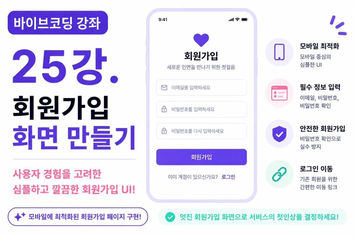
For this project, we'll collect just these three pieces of information initially:
Email address
Password
Confirm password
User profiles will be completed in a separate screen after registration.
Why Limit the Information?
New developers often try to collect extra information during registration, like:
Nickname
Age
Gender
Interests
Profile photo
But this increases user drop-off rates.
It's best practice to keep registration simple and collect additional profile information after login.
Screen Layout
The registration screen will be arranged in this order:
App logo
Title
Email input field
Password input field
Confirm password field
Registration button
Login link at the bottom
This simple structure is sufficient for a good user experience.
Requesting Help from Cursor AI
We'll now ask Cursor AI to create our screen using these instructions:
Using Next.js and Tailwind CSS, create a mobile-first user registration screen.

Create just three input fields:

Email
Password
Confirm password
The AI will generate the basic screen layout for us.
Title Design
At the top, place this title:
Sign Up
Add a simple subtitle like:
The first step to meeting new connections
Email Input Field
First input field with placeholder text:
Enter your email
This will connect to Supabase Auth later in the project.
Password Input Field
Second input field using password type (text hidden on screen).
Placeholder text:
Enter your password
Password Confirmation
We'll ask users to enter their password twice to reduce input errors.
In future steps, we'll verify both entries match.
Registration Button
The button should be prominent and visually distinct.
Using Tailwind CSS, we'll create:
Purple background
Rounded corners
Larger size for better visibility
This button is the most important element on the screen.
Login Link
At the bottom of the screen, provide a link for existing users:
Already have an account?

Log in
It's standard practice to always offer both registration and login options together.
Creating Input Component
Input fields will be used across multiple screens:
Login
Profile
Search
Chat
To avoid repetition, we'll create a reusable Input component.
Creating Button Component
Similarly, buttons will be used in multiple contexts:
Registration
Likes
Save
Edit profile
A common Button component makes maintenance easier.
Applying Tailwind Styles
We'll apply these styling principles:
Sufficient padding and spacing
Rounded input fields
Subtle shadow effects
Larger buttons for better touch targets
Mobile-first responsive layout
The goal is a simple but polished interface.
Refining with Cursor AI
If the initial AI-generated design doesn't meet your expectations, you can request specific changes:
Widen the spacing between input fields.
Make the button full-width on screen.
Increase title font size slightly.
This iterative process helps achieve your desired UI through conversation with AI.
Testing Responsiveness
The registration screen is designed for mobile,
but we'll also test it on tablets and desktops.
Tailwind's responsive classes will automatically adjust the layout based on screen size.
No Functionality Yet
This lesson focuses solely on UI design.
Clicking the registration button won't actually create an account yet.
In the next lesson, we'll connect to Supabase Auth and implement the actual registration functionality.
GitHub Commit
After completing the screen, ask AI for a commit message:
Create a Git commit message appropriate for adding the registration screen.
Making regular commits is an important development practice.
Characteristics of a Good Registration Screen
A good registration experience features:
Few input fields
Ease of use
Mobile-friendly design
Minimal error potential
Simplicity leads to better user experience than complex forms.
Next Lesson Preview
In the next lesson, we'll connect Supabase Auth to enable actual registration functionality.
We'll walk through how user-entered email and password get stored in Supabase,
and how a real account is created through this process.
Closing
In this lesson, we built the first actual screen of our dating app: the registration page.
We completed a mobile-friendly UI using Tailwind CSS and Cursor AI,
and designed reusable input and button components.
In the next lesson, we'll connect this screen to Supabase Auth to implement real registration functionality and advance our service development further.
FAQ
Why limit registration to just email and password?
Collecting minimal information during registration reduces user drop-off rates, making it more likely users will complete the process. Additional profile details can be collected after login.
How does Tailwind CSS help in mobile-first design?
Tailwind's responsive classes automatically adjust layout elements based on screen size, ensuring a consistent experience across devices without requiring separate code for each device type.
Korean Source
This article is an English localization of a Korean-language report from BlogScore. Original: [바이브코딩 강좌] 25강. 회원가입 화면 만들기