
Building a Reusable Layout for Your Next.js Project
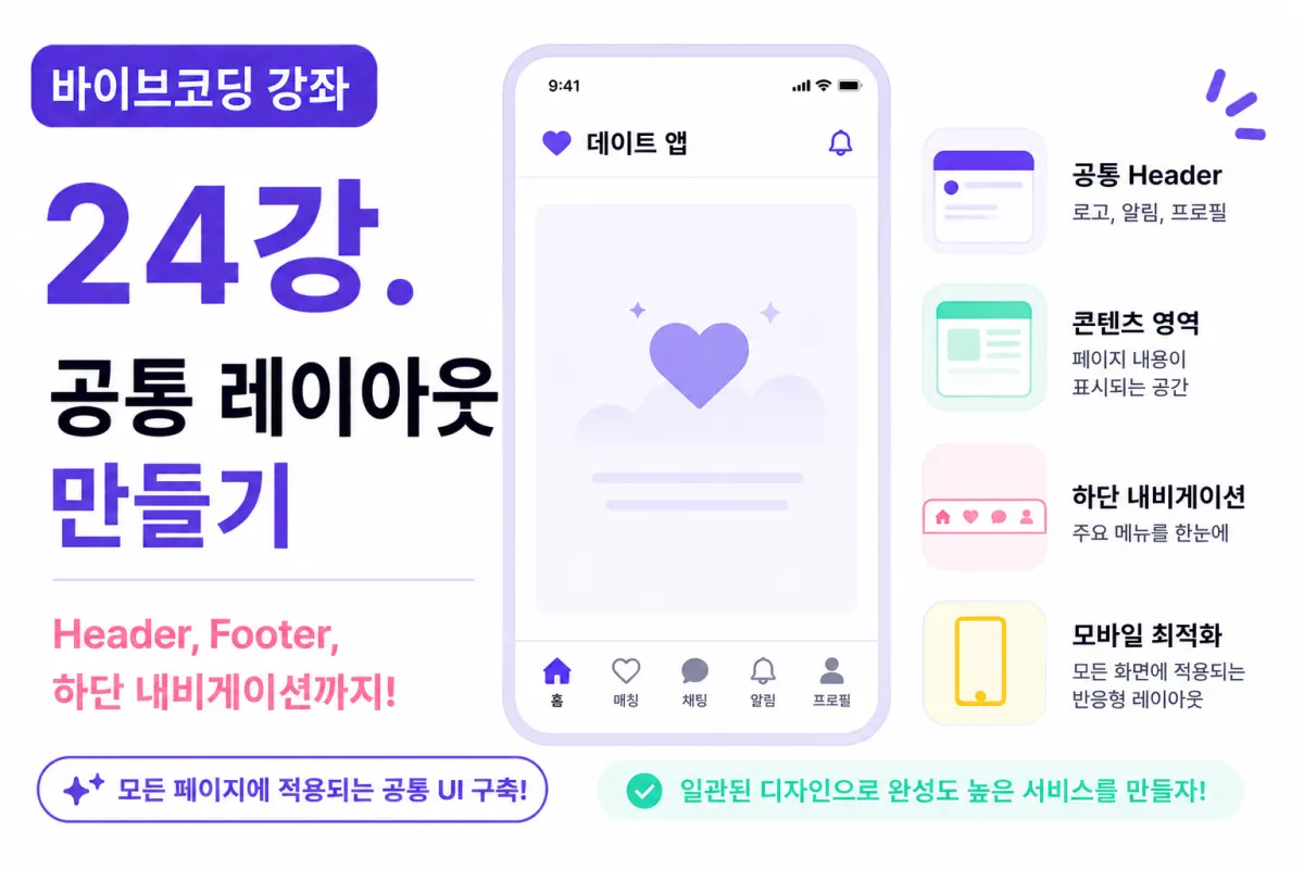
What You'll Learn in This Lesson
Last lesson focused on designing your project folder structure.
Your project's foundation is now complete.
However, all pages currently look different from each other.
In a real service, every screen should share the same design and structure.
This lesson will teach you to create a common layout (Layout), allowing you to reuse it across all future pages in your project.
You'll learn:
The concept of Layouts
Understanding App Router Layout
Creating a Header
Building a Footer
Setting up a Mobile Tab Bar
Configuring reusable layout components
What Is a Layout?
A Layout is the common screen used across all pages.
For example:
Top logo
Bottom menu
Common background
Overall padding
All these elements remain consistent across every screen.
Writing them for each page would be highly inefficient.
Therefore, you create a Layout once and reuse it everywhere.
Next.js Layout Structure
In App Router:
app/

layout.tsx
This file manages the overall layout.
All pages render within layout.tsx.
In other words:
Sign-up,
Login,
Profile,
Chat
All screens share the same structure.
Why Use a Layout?
For example, imagine adding a logo to every page.
If you have 20 pages, you'd need to write it 20 times.
With a Layout, you write it once and done.
Maintenance becomes much simpler.
Requesting Help from Cursor AI
First, ask Cursor AI:
Date app's common Layout please.

Mobile-focused with Header and Bottom Navigation included.
The AI generates basic layout code.
Creating the Header
Your top Header should include:
App logo
Service name
Notification button
After login, you'll display a user profile icon as well.
Keep the Header simple and minimal.
Do You Need a Footer?
This project is developing a mobile app style interface.
Therefore, it won't use a large footer like traditional websites.
Instead, if you need simple copyright information,
you can manage it as a separate component.
Building the Bottom Navigation
This is the most commonly used menu in dating apps.
This project will use five main menu items:
Home
Matches
Chat
Notifications
Profile
This menu appears consistently across all screens.
Selecting Menu Icons
Choose simple icons, not overly flashy ones.
For example:
Home
Heart
Message
Bell
User
This level of simplicity is sufficient.
Ask the AI:
Please use simple icons.
To get appropriate results.
Center Screen Area
The center area, excluding Header and Bottom Navigation,
will display page-specific content.
For example:
Login screen shows login form,
Profile screen displays profile cards,
Chat screen shows chat lists.
The Layout simply wraps the content.
Creating a Container
Mobile apps have limited screen width.
Therefore, it's good to create a Container with maximum width settings.
For example:
max-width

padding

margin
Apply these consistently across all screens for uniform padding.
Setting the Background
This project uses a simple white background by default.
The accent color will be purple tones.
Maintaining consistent visual style improves overall quality significantly.
Common Button Styles
While creating the Layout, define common button styles too.
For example:
Primary Button
Secondary Button
Danger Button
Create these now for reuse across all screens later.
Preparing a Loading Screen
Your project will have data loading times.
<Prepare a Loading component for this purpose.
Ask the AI:
Create a simple loading spinner.
It generates a basic component quickly.
Preparing an Error Screen
Error handling is essential in any service.
For example:
Network errors
Server errors
Login errors
Create a common Error component for reuse across all screens.
Refactoring with Cursor AI
After completing your Layout,
ask Cursor AI:
Improve the current Layout structure.
It suggests removing unnecessary code, splitting components, and performance improvements.
What's Next?
All future pages will be built within this common Layout.
For example:
Sign-up screen,
Login screen,
Chat screen
Will all share the same Header and Navigation.
This makes development much faster.
Characteristics of a Good Layout
A good Layout should be:
Simple
Reusable
Easily modifiable
Include only necessary features, not too many.
Starting Screen Development Now
This lesson completes your project's foundational structure.
From the next lesson onward,
You'll begin building actual screens like the sign-up page,
Moving toward real service development.
Next Lesson Preview
The next lesson will create a sign-up screen.
We'll use Tailwind CSS and Cursor AI to build a mobile-optimized sign-up UI,
And prepare integration with Supabase Auth.
Closing Thoughts
The common Layout is a crucial element that makes your project feel like one cohesive service.
This lesson covered designing Header, Bottom Navigation, and common styles to create a reusable Layout.
All future screens will be built on this structure.
In the next lesson, we'll build the first actual screen: the sign-up page.
FAQ
Why is a common layout important in web development?
A common layout ensures consistent design across all pages, reduces redundant code, and makes maintenance easier by allowing changes to be made in one place.
How does using AI like Cursor help with creating layouts?
AI can generate initial layout code based on simple requests, which saves time and provides a starting point for developers to refine and customize.
Korean Source
This article is an English localization of a Korean-language report from BlogScore. Original: [바이브코딩 강좌] 24강. 공통 레이아웃 만들기