
Building a Professional Landing Page: A Practical HTML & CSS Tutorial
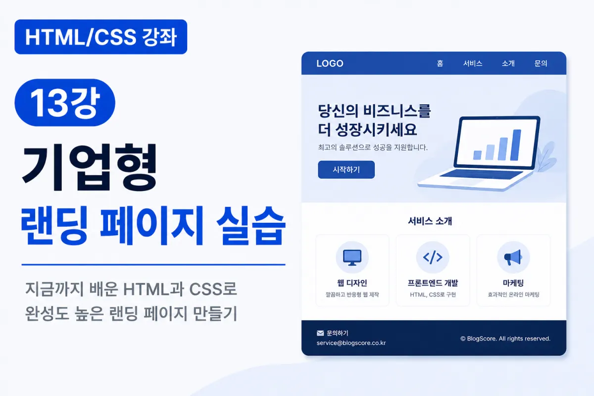
What is a Landing Page?
When browsing the internet for products or services, you'll often encounter clean, single-page websites that present information clearly.
Examples include company introduction pages,
product overview pages,
course description pages,
and app download pages.
This type of page, which displays key information at a glance for first-time visitors, is called a landing page.
Businesses frequently use landing pages to promote new products, events, or services.
This Lesson's Goal
In this lesson, we'll create a polished corporate-style landing page using the HTML and CSS concepts we've learned so far.
Through this hands-on practice, you'll implement these elements:
Top navigation menu
Main banner (Hero Section)
Service descriptions
Feature cards
Contact button
Footer section
Responsive layout
Since this is a common structure in professional web design, we highly recommend building it yourself.
The Basic Structure of a Landing Page
Most landing pages follow this basic structure:
Header

↓

Hero Section

↓

Service Description

↓

Features (Card)

↓

Contact

↓

Footer
The structure is simple, but how well you arrange each section determines the page's effectiveness.
Creating the Header
First, let's create the top navigation menu.
HTML
<header>

    <h1>BlogScore</h1>

    <nav>

        <a href="#">Home</a>

        <a href="#">Services</a>

        <a href="#">Contact</a>

    </nav>

</header>
In CSS, we'll use Flexbox to position the logo and menu on opposite sides.
header{

    display:flex;

    justify-content:space-between;

    align-items:center;

}
Creating the Hero Section
The Hero Section is the first area visitors see when they arrive.
This typically includes:
Larger headline
Short description
Featured image
Call-to-action button
For example, you might see:
<h2>

HTML & CSS Web Design for Beginners

</h2>

<p>

Introductory web development course for beginners

</p>

<button>

Get Started Now

</button>
This format is commonly used in landing pages.
Service Description Section
Next, let's create a section to describe our services.
<section>

    <h2>

        Key Services

    </h2>

</section>
Here, you'd briefly describe your company or course features. The key is to make the main content easily understandable for visitors.
Creating Card UI
Service descriptions often use card-based interfaces.
HTML
<div class="card">

    <h3>HTML</h3>

    <p>Building web page structure</p>

</div>
CSS
.card{

    padding:20px;

    border:1px solid #ddd;

    border-radius:10px;

    box-shadow:0 4px 10px rgba(0,0,0,0.08);

}
Using Flexbox to arrange multiple cards creates a clean service description area.
Styling Buttons
Landing pages always include buttons designed to guide visitor actions.
Common examples include:
Get Started
Free Trial
Contact Us
Download
Here's a CSS example for styling buttons:
button{

    background:#154B95;

    color:white;

    padding:14px 28px;

    border:none;

    border-radius:8px;

}
Using eye-catching colors improves button visibility.
Creating the Footer
Add a footer section at the bottom of your webpage.
<footer>

    © BlogScore

</footer>
Footers typically include:
Copyright information
Company name
Email address
Contact information
Privacy policy
The footer also helps establish site credibility.
Using Flexbox Effectively
Landing pages heavily rely on Flexbox for layout arrangements.
For example:
.cards{

    display:flex;

    gap:20px;

}
This makes cards align neatly horizontally. Flexbox also helps with responsive design implementation.
Implementing Responsive Design
For mobile devices, consider these adjustments:
@media (max-width:768px){

    .cards{

        flex-direction:column;

    }

}
This changes cards to stack vertically for better mobile viewing.
Pro Tips for More Effective Landing Pages
Great landing pages prioritize readability over flashy effects.
Consider these design principles:
Use sufficient whitespace
Create visual hierarchy with font sizes
Limit your color palette to 2-3 main colors
Make buttons highly visible
Maintain consistent spacing between cards
Avoid overcrowding the page with too much content
Simplicity and cleanliness create a professional appearance.
Common Beginner Mistakes
1. Overloading one screen with all content
Divide information into appropriate sections for better organization.
2. Inconsistent spacing between cards
Use Flexbox's gap property to easily maintain consistent spacing.
3. Buttons blending into background colors
Ensure buttons have sufficient contrast with the background for better visibility.
4. Ignoring mobile responsiveness
Landing pages must be responsive to provide good user experience across all devices.
Key Takeaways from This Lesson
Let's review what we've covered:
Landing pages deliver key information directly to visitors.
The standard structure includes Header, Hero Section, Service Descriptions, Cards, and Footer.
Flexbox simplifies layout creation for responsive designs.
Cards and buttons are the most commonly used UI elements on landing pages.
Responsive design ensures good mobile viewing experience.
Simplicity with proper whitespace enhances page quality.
This hands-on practice applies all previously learned HTML and CSS concepts to a real-world project.
Conclusion
In this lesson, we created a corporate-style landing page using HTML and CSS.
You've now applied semantic tags, Flexbox, Box Model, buttons, cards, and responsive design to build a complete webpage. This gives you a natural understanding of how to structure web pages for professional projects.
Next, in our upcoming lesson, we'll create a personal portfolio website. You'll build a site that showcases your skills and projects - a valuable resource for both real-world work and job applications.
FAQ
What is a landing page?
A single-page website designed to present key information clearly for first-time visitors, often used for product promotion or service introduction.
Why are cards commonly used in landing pages?
Cards provide a clean, organized way to display multiple services or features with consistent spacing and visual hierarchy.
Korean Source
This article is an English localization of a Korean-language report from BlogScore. Original: [Html/CSS 강좌] 13강 기업형 랜딩 페이지 실습