
Building Card-Style UI for Dating Apps: A Step-by-Step Guide
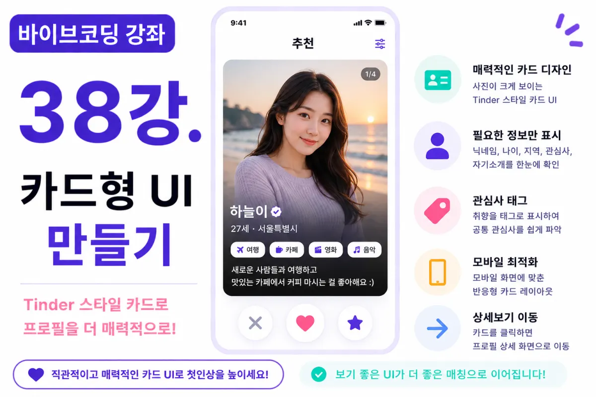
What You'll Learn in This Lesson
Last week, we learned how to retrieve user lists from the Supabase Database.
This time, we'll display the retrieved data in a visually appealing card (Card) format.
In this lesson, you'll learn:
Designing card UIs
Placing profile pictures
Displaying user information
Showcasing interest tags
Creating responsive designs
Preparing animations
By the end of this lesson, you'll have a dating app-style main screen ready to go.
Why Use Card-Based UIs?
Most dating apps use card-based interfaces because they allow users to focus on one profile at a time and naturally integrate features like likes or swipes.
Tinder is a prime example of this approach.
Building the Card
In this project, we'll place these elements inside each card:
Profile photo
Nickname
Age
Location
Interest tags
Short bio preview
The goal is to give users a quick understanding of the profile just by looking at one card.
Requesting Help from Cursor AI
First, we'll ask Cursor AI to create our dating app-style profile card using Next.js and Tailwind CSS:
Using Next.js and Tailwind CSS, create a dating app style profile card. Design it mobile-first with the photo taking up most of the space.
The AI generates a modern card UI for us.
Placing Profile Photos Prominently
The profile photo should take up the largest area in the card since it's what users see first.
We'll maintain consistent aspect ratios and set appropriate sizes to prevent images from getting cut off.
Nickname and Basic Information
Below the photo, we'll display the nickname prominently:
27 · Seoul
Then below that, we'll show age and location together in a concise format.
The more concise the information, the better.
Interest Tags
Interests will be displayed as tags below the profile:
Coffee · Movies · Travel
This format helps users quickly understand someone's preferences.
Bio Preview
The bio should show just the first two lines rather than the full text to keep cards from becoming too large.
Users can see the full bio on a detailed profile screen.
Card Shadow Effect
We'll apply Tailwind CSS's shadow classes to give cards a slight floating effect on screen.
This subtle detail enhances the overall feel of the service.
Rounded Corners
Both profile photos and cards will have rounded corners.
Dating apps benefit from soft, rounded designs rather than sharp edges to create a more welcoming atmosphere.
Hover Effects
On desktop, we'll make cards slightly enlarge when hovered over.
On mobile, this will be replaced with touch animations.
We prefer subtle effects rather than excessive animation for better user experience.
Spacing Between Cards
We'll maintain sufficient spacing between cards to avoid a cramped appearance.
We'll use Tailwind's margin and padding classes to achieve the right spacing.
Image Loading Handling
We'll show a placeholder while images load, then smoothly transition to the actual photos when ready.
This prevents screen flickering during loading.
Card Click Functionality
Clicking on a card will take users to the detailed profile view.
This allows users to preview information before deciding whether to like someone, creating a more natural flow for user experience.
Improving with Cursor AI
After completing the feature, we'll ask Cursor AI:
Improve the card design to make it more refined.
The AI will suggest improvements for:
Shadow effects
Card proportions
Button placement
Margins and spacing
Responsive Testing
On mobile, cards will take up the full screen width.
On tablets, we'll display two columns,
And on desktop, three or four columns can be shown.
Tailwind's grid system makes this implementation straightforward.
Preparing for Swipe Functionality
This lesson doesn't implement swipe functionality, but the card structure is designed to easily connect with left/right swipes in future lessons.
Testing Your Implementation
Verify these elements:
Card display
Photo rendering
Interest tags display
Bio preview display
Responsive layout
Click navigation
If everything works properly, your card UI is complete.
GitHub Commit
After completing the feature, ask Cursor AI to create a commit message:
Create a commit message for the card UI implementation.
This helps maintain good project management practices by committing features in logical units.
Additional Features in Production
In real services, you'd also include:
Multiple photo viewing
Image zooming
Online status indicators
Verified badges
This project focuses on implementing the basic card UI structure.
Now It Looks Like a Real Dating App
After this lesson, your user list will be displayed in modern card format.
You'll now be ready to connect like/dislike functionality and swipe features to make it work like an actual dating app.
Next Lesson Preview
In the next lesson, we'll implement the like feature.
You'll learn how users can send likes to profiles they're interested in and save those preferences to the Supabase Database.
Conclusion
This lesson covered creating a card-based UI for dating apps.
We displayed profile photos, nicknames, ages, interests, and bios in an attractive card format, completing a main screen that resembles real dating applications.
In the next lesson, we'll implement like functionality to begin building the matching system.
FAQ
Why do dating apps use card-based UIs?
Card interfaces allow users to focus on one profile at a time and naturally integrate features like likes or swipes, making the experience more intuitive.
What's the benefit of rounded corners in dating app design?
Rounded corners create a softer, more welcoming atmosphere compared to sharp edges, which aligns with the friendly nature of dating applications.
Korean Source
This article is an English localization of a Korean-language report from BlogScore. Original: [바이브코딩 강좌] 38강. 카드형 UI 만들기